“Would you like to have this “Color Glass” icon option for iOS 26?”
Via @idevicehhelp on X: https://is.gd/klIjTD
“Would you like to have this “Color Glass” icon option for iOS 26?”
Via @idevicehhelp on X: https://is.gd/klIjTD
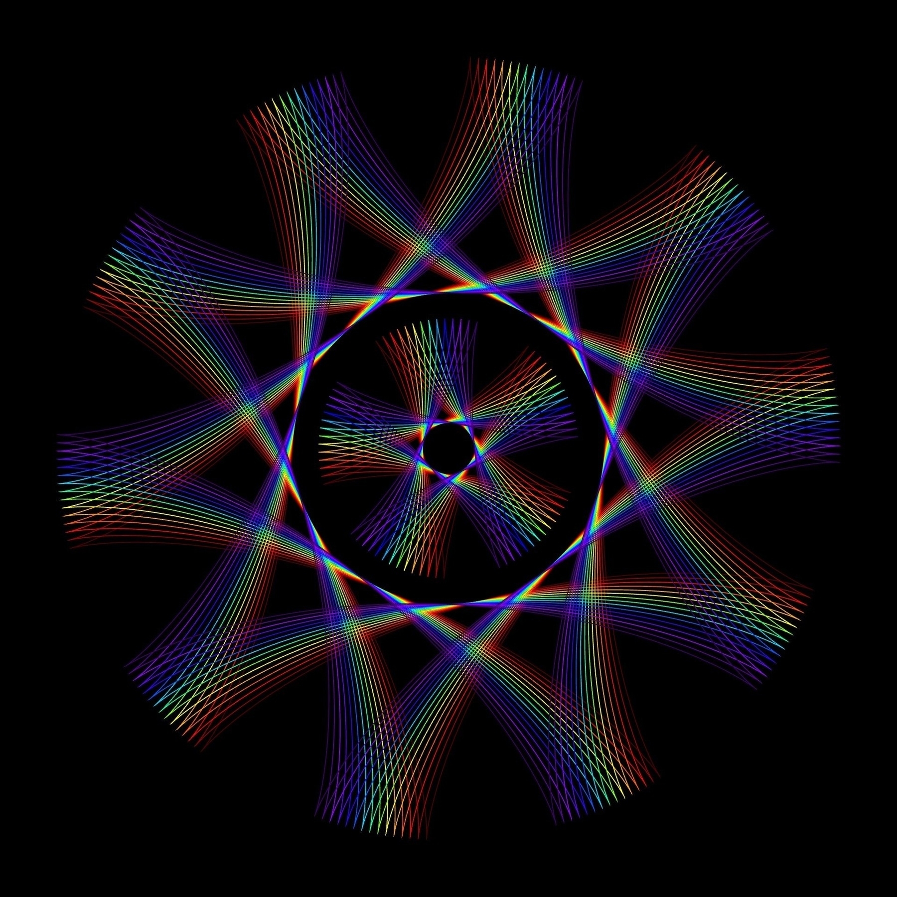
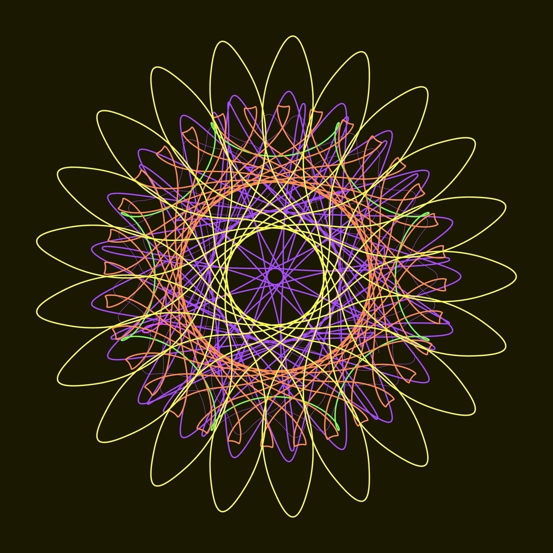
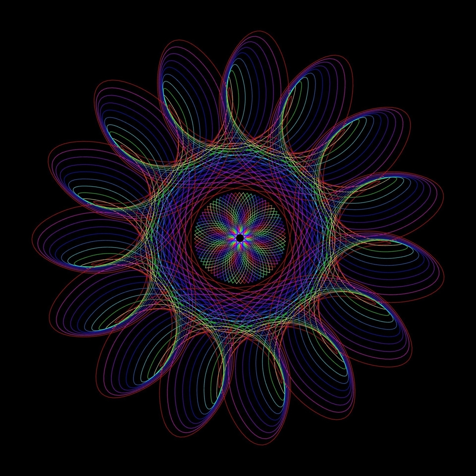
Spiralator — A spirograph drawing tool. Free, online, mobile-friendly.
“Designed to help explore and express the beautiful geometries of circles rotating in circles. Inspired by the old spirograph toy, but not constrained by its practicalities."
**➔ Source: ** spiralator.com
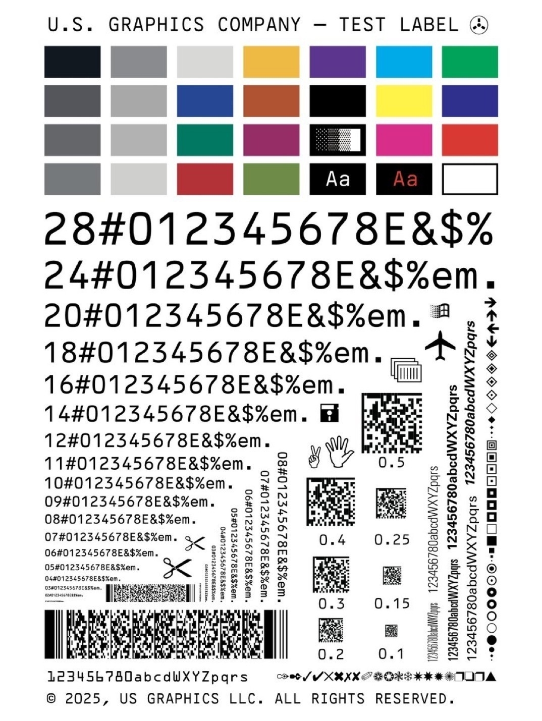
USGC TEST LABEL, 4 x 6 in. TX-52 Los Alamos Mono™
Only from U.S. Graphics Company.
↓
Source: https://is.gd/Bdg5Zf
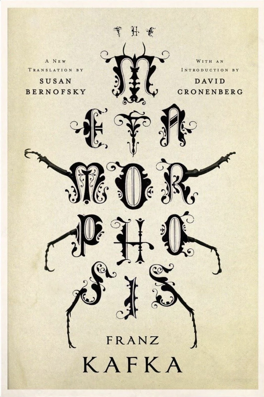
Book Cover for ‘The Metamorphosis’ by Franz Kafka
↓
Source: https://is.gd/b9lnnR
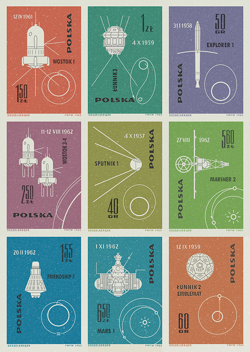
Vintage Polish postage stamps featuring space missions and satellites from 1957-1962.
↓
Via: https://is.gd/c5M9ks
**Some lovely reimagined popular iOS app icons, designed by @emailpixel over on X. **
Source: https://x.com/emilpixel/
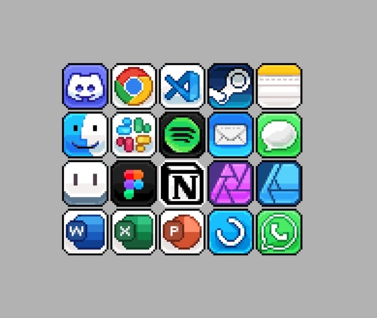
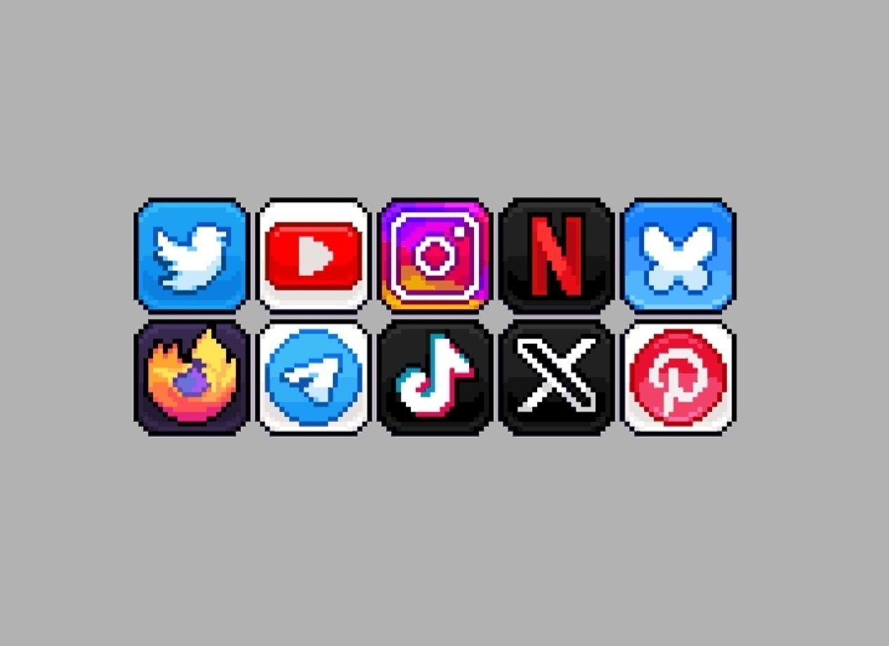
Have asked if the Feedly app icon could be tackled as well, given I designed that back in 2011, and is a pretty well used RSS app.
Monday, July 7, 2025
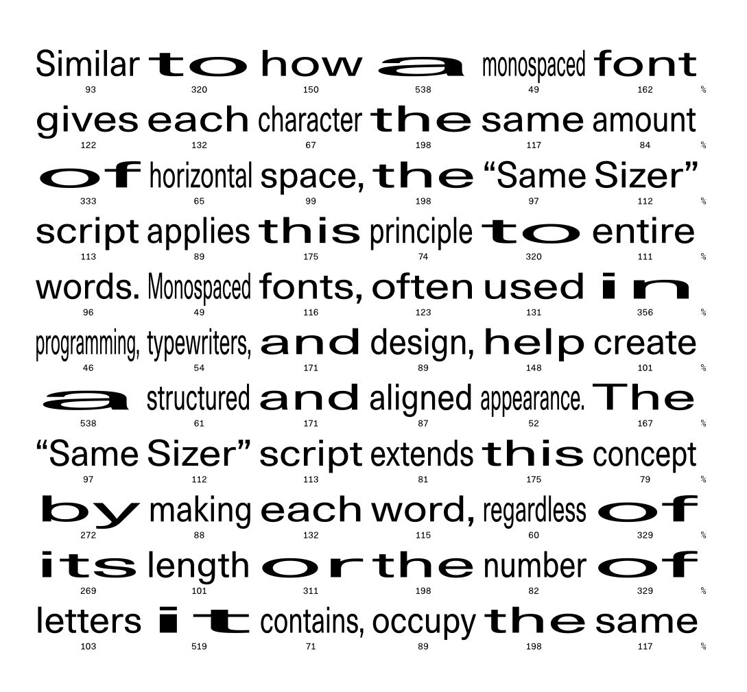
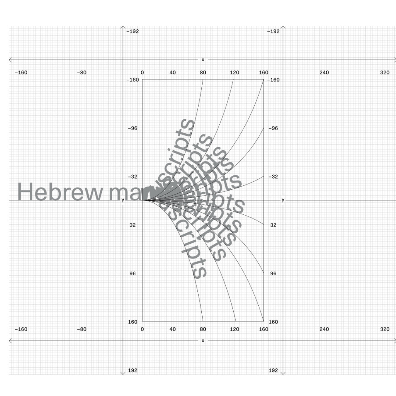
Alternative Layout System — inspired by techniques from Hebrew & Arabic manuscripts, to challenge conventional layouts.
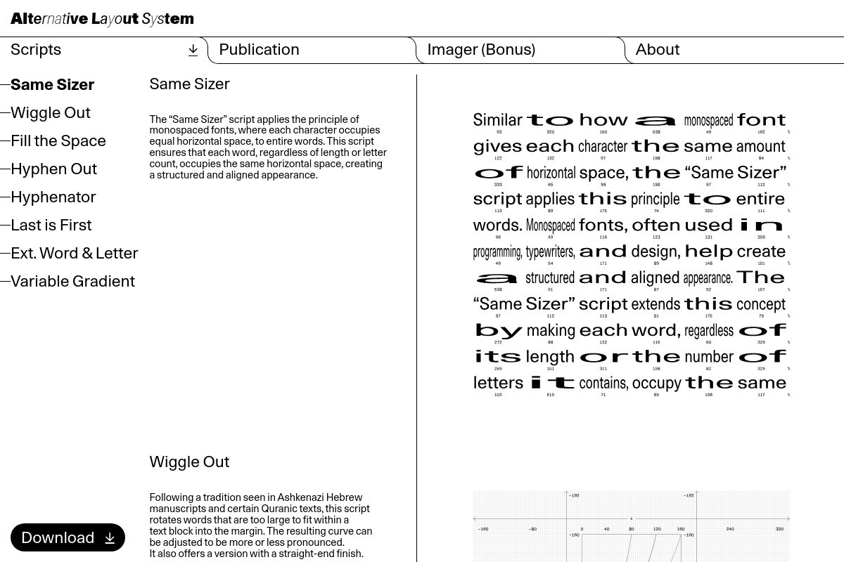 

✏️ Having had a long history print and design, starting as an 18 years old apprentice paste-up artist: waxing bromide strips of typeset columns onto card layout grids, I’m always drawn to anything that evokes those past experiences with layout, typography etc.
Source: alternativelayoutsystem.com/:
“This research rethinks paragraph formatting, inspired by techniques from Hebrew and Arabic manuscripts to challenge conventional layouts. Funded by the Leenaards Foundation and supported by Adobe’s plugin tools, the project led to the “Alternative Layout System” plugin, now available for free download on the website. A publication showcasing designers’ experiments with these scripts is also accessible on the website’s “Publication.”
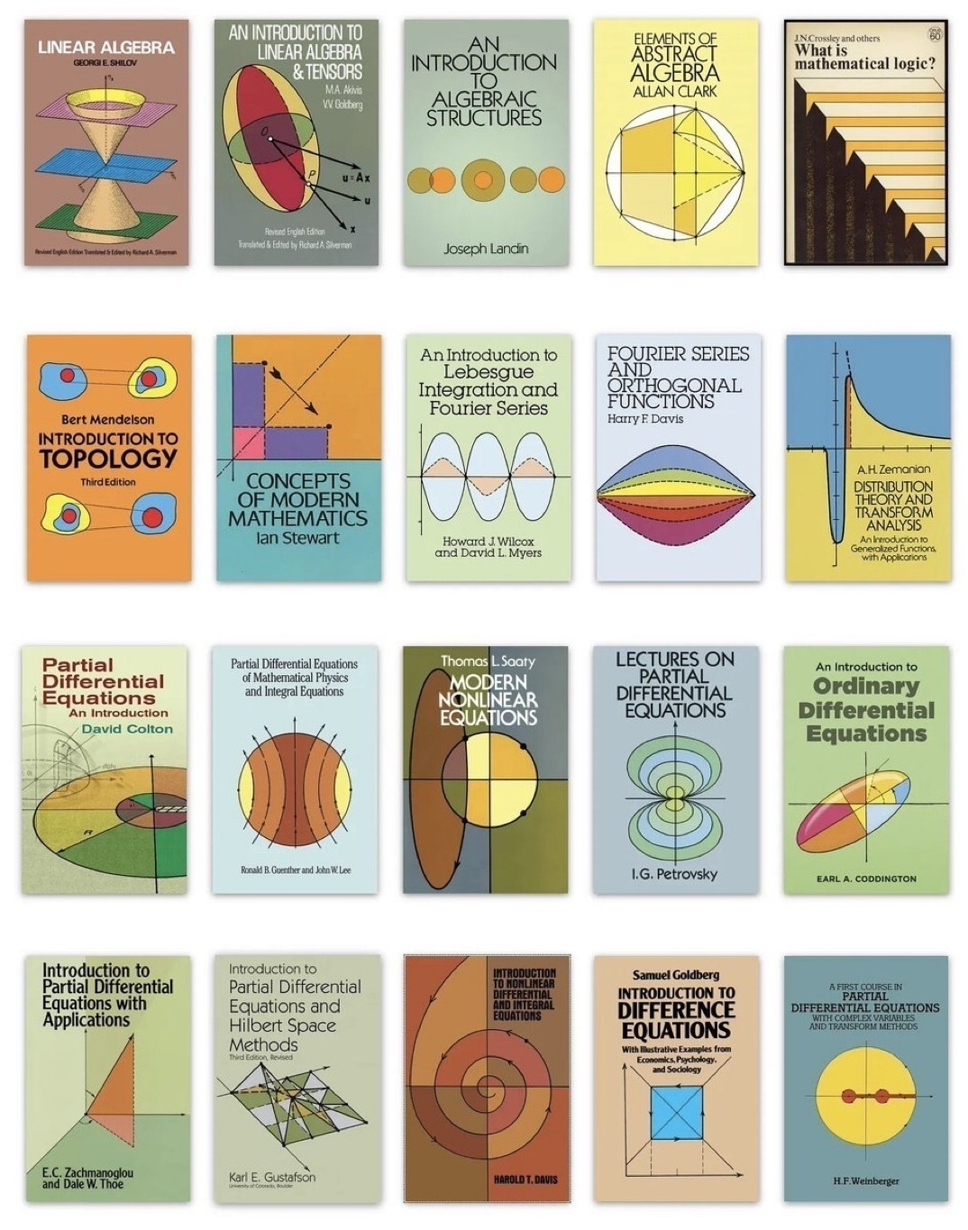
Gorgeous math book covers from Dover Publications @doverpubs on X.
Sunday, May 11, 2025
About:
”typo/graphic posters is a platform on behalf of design through the poster medium_.
it focus exclusively on typographical and graphical posters, those that challenge type, colors and shapes to express its message.”
♥️ Source: typographicposters.com/
Tuesday, April 29, 2025
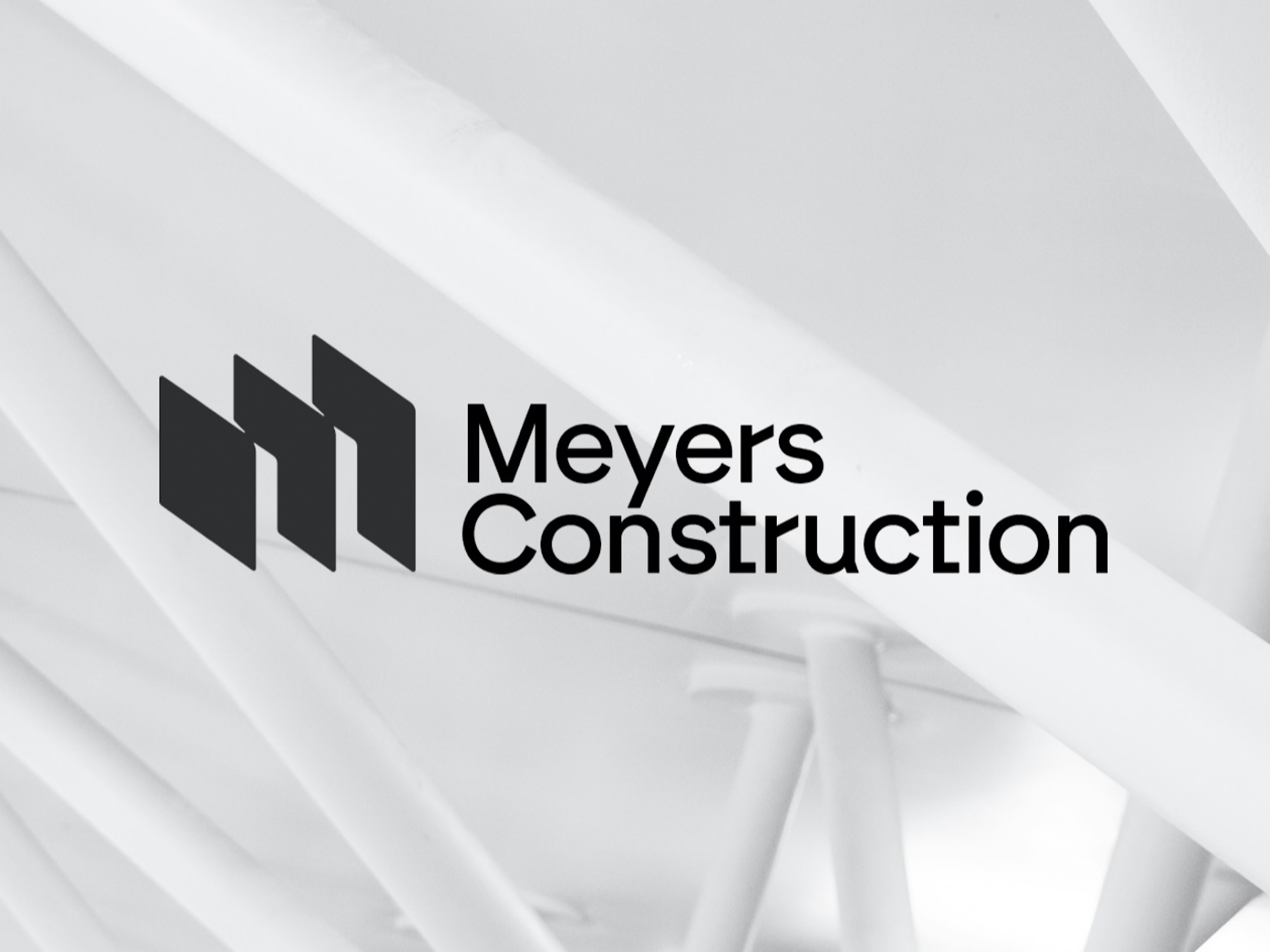
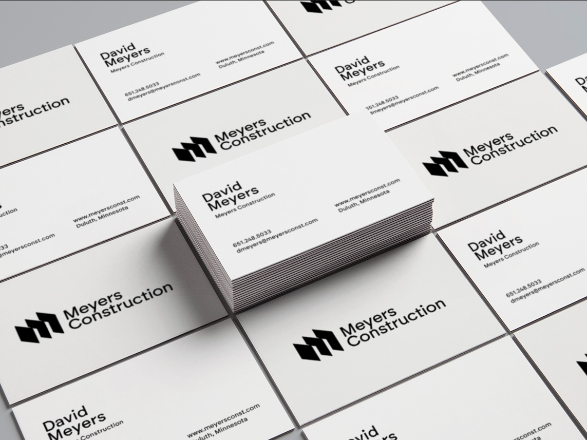
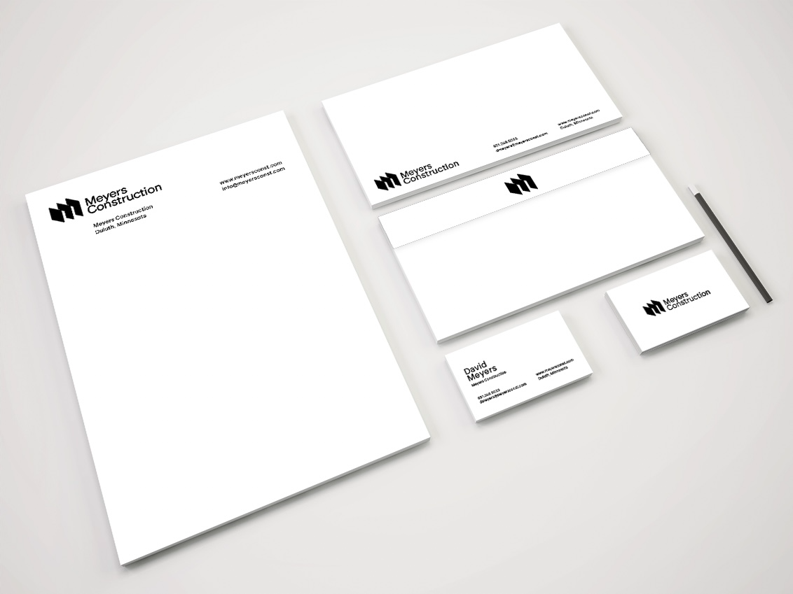
Finally wrapped up Meyers Construction Logo and Stationery Design project. Couple of business card and stationery mock-ups to help David with the basics.
Really really happy with how this logo turned out; probably 20 pages of sketches in the end.
❤️ If anyone needs a new logo design, then please do get in contact.
👉 View my Logo Portfolio over at Smitho.graphics
Monday, April 28, 2025
“Introducing Times Newer Roman, a font that looks just like Times New Roman, except each character is 5-10% wider. Fulfill lengthy page requirements with hacked margins, adjusted punctuation sizing, and now, Times Newer Roman!”
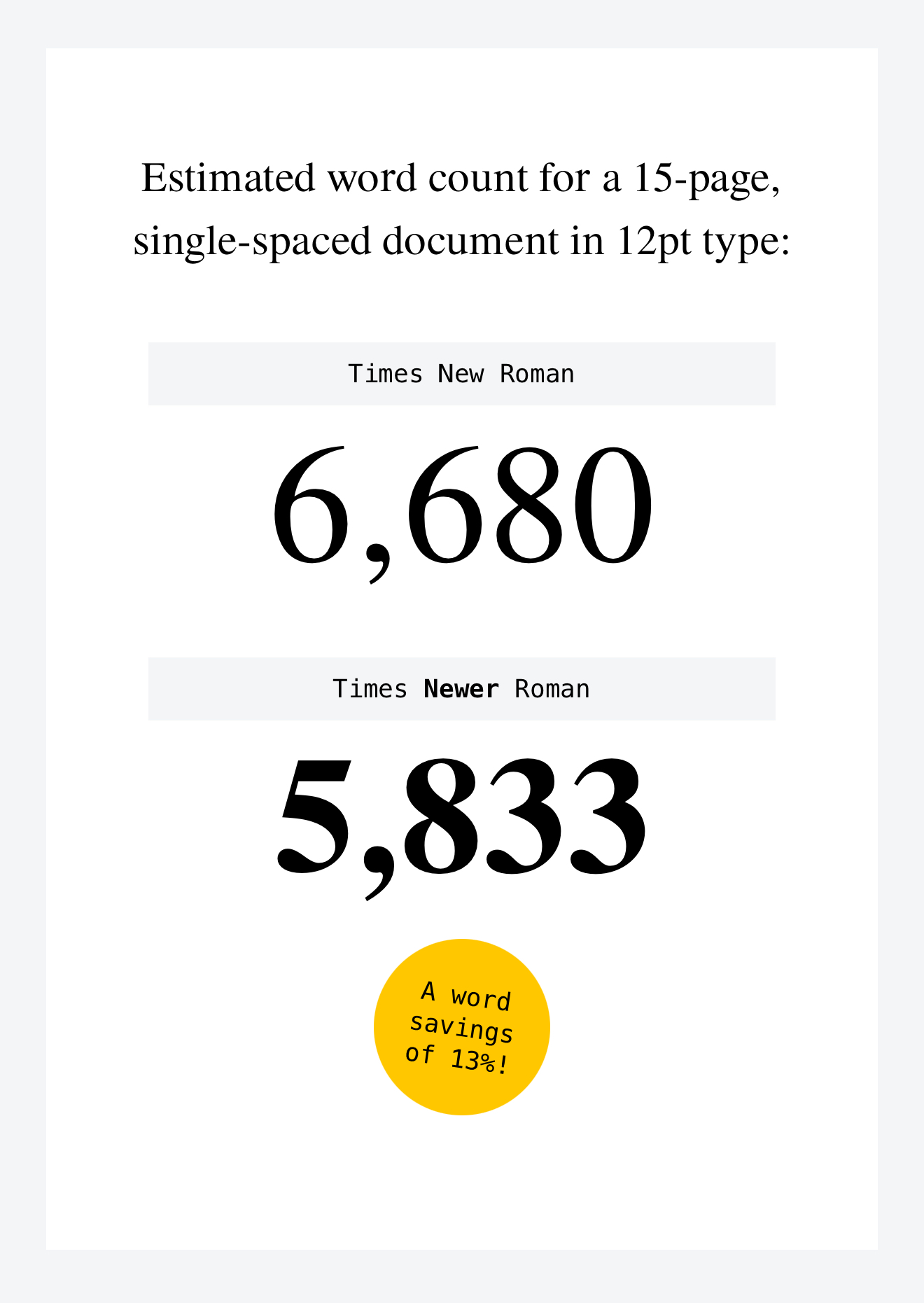
✏️ First time I’ve come across this brilliant company and their website: mschf.com They provide so many unique and cool downloads, that’s it’s definitely worth subscribing. They also have iOS and Android apps that are worth a look.
⇲ Source: timesnewerroman.com/
⍟ By: mschf.com