This Logo Design Package includes the primary logo design, as well as design of Letterhead and Business Cards.
The project allows up to 3-5 initial logo design concepts, which are usually presented in pencil sketch format.
These initial sketches allow for some initial brainstorming, and idea progression.
Once feedback has been given on the initial sketches, then I proceed to Adobe Illustrator to turn the sketch ideas into more polished digital vector format.
I’m very fluid and accommodating during this initial sketch and vector stage, so I generally don’t impose any rigid rules. This is because the early logo design idea phase needs to be open-minded, and I welcome client ideas and mutual brainstorming, to further the direction of any logo design ideas.
I use Dropbox Paper to Project Manage the presentation of the sketches, photos, mock-ups, and other digital files. Paper allows for comments and annotations to be made by both parties directly on any uploaded image, or as standalone threaded comments.
Once we have a logo design idea/direction agreed, then I tend to use the remaining time to polish up the vector version, and I generally also provide 2-3 further minor variations off this idea, so this often helps the client feel they have a few further options to choose from.
Once client chooses and approves the final Logo Design, I then proceed to finalise the project with some digital mockups, showing the logo on various styles of stationery, marketing merchandise to help the client actually visualise how the logo looks ‘in use’.
I also provide a ‘Transfer of Copyright’ Letter, which basically provides you with full ownership of the logo design in question.
—
Ultimately I’m a passionate and very methodical designer, and enjoy the dual collaboration with my clients, and also like to keep the process as open-minded and flexible as possible.
You can be as hands-on or hands-off as you like, so that is entirely up to you. You might prefer me to just go off and do my thing, or you may like to be part of the exploration process in some way.
If all of that sounds promising, then I’d love to hear from you if you’d like to work with me.
Has blown my mind with the vastness of the online content, all related to the history of Apple.
I’ve been an avid long-term Apple devotee; from owning an Apple Macintosh Classic and Apple Macintosh LC, as well as using Apple Macintosh computers through out the last 40 years in a professional work capacity, this website brings back a lot of memories:
Welcome to the Mothership
“Welcome to The Mothership! The Apple Lisa and Early Macintosh Archive. The Premier Apple Lisa and Early Macintosh Archive and the World’s Largest Apple Advertising and Brochure Gallery Since 1999”
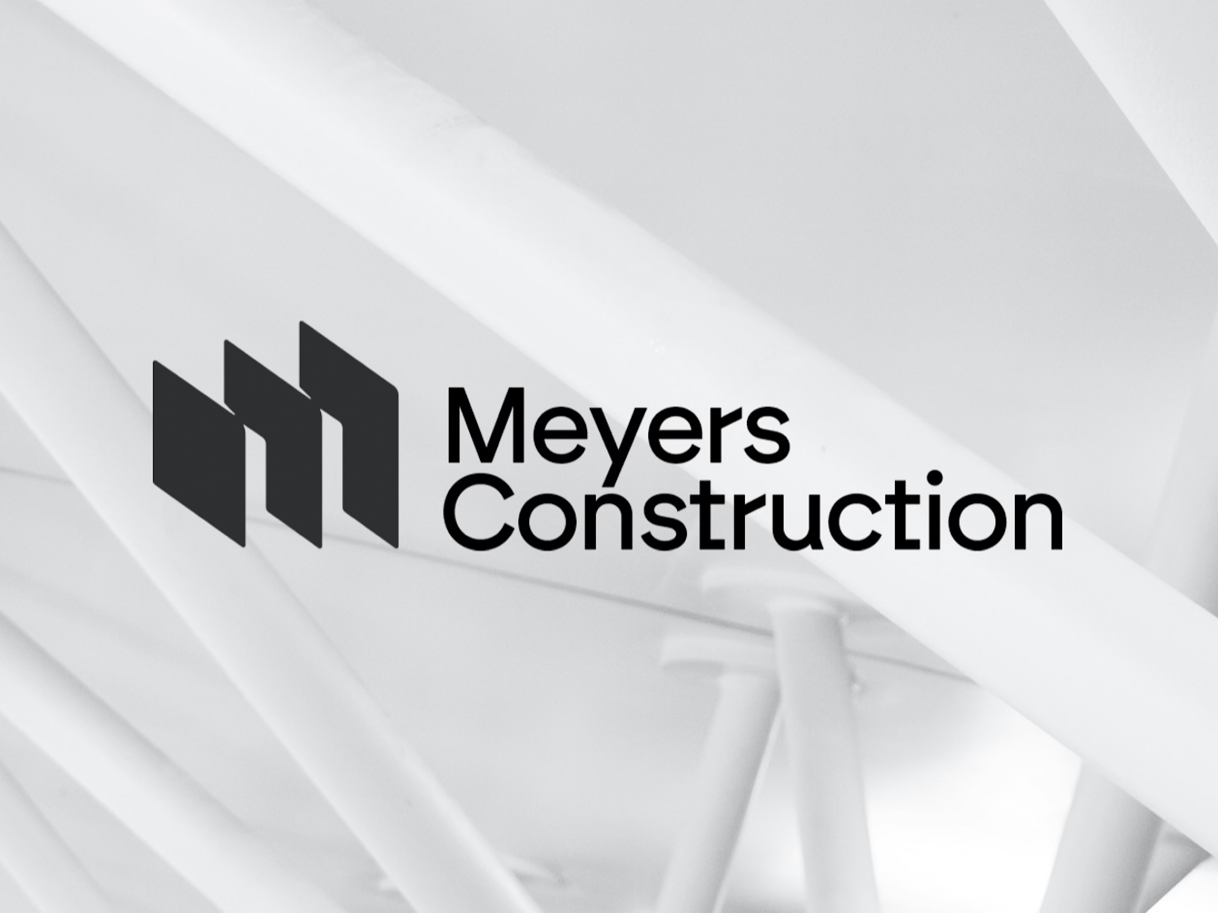
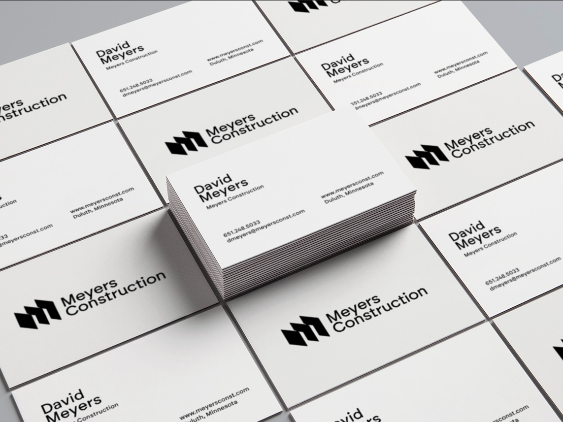
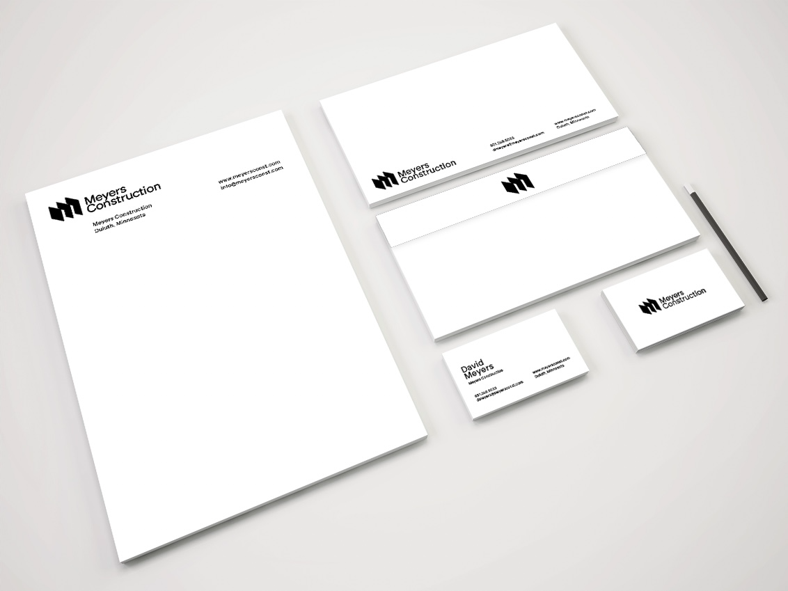
Finally wrapped up Meyers Construction Logo and Stationery Design project. Couple of business card and stationery mock-ups to help David with the basics.
Really really happy with how this logo turned out; probably 20 pages of sketches in the end.
❤️ If anyone needs a new logo design, then please do get in contact.
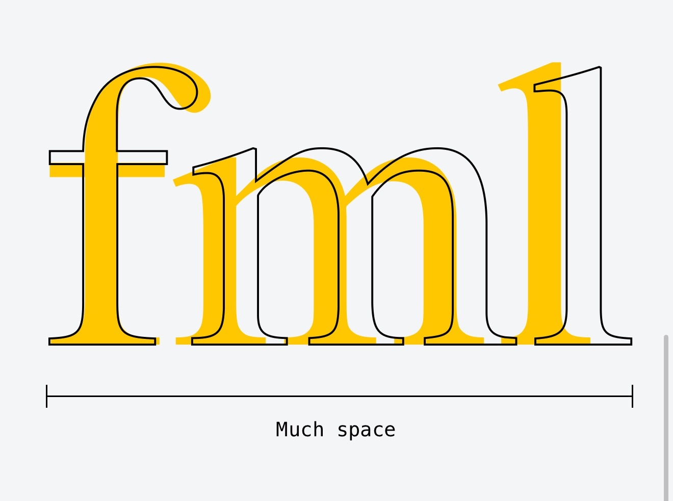
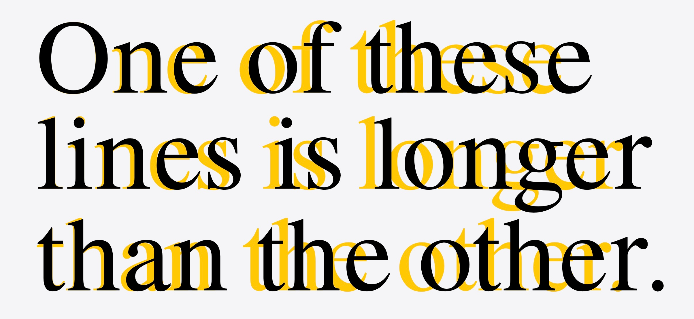
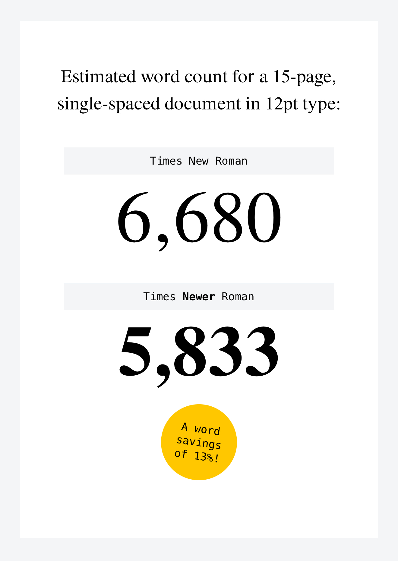
“Introducing Times Newer Roman, a font that looks just like Times New Roman, except each character is 5-10% wider. Fulfill lengthy page requirements with hacked margins, adjusted punctuation sizing, and now, Times Newer Roman!”
✏️ First time I’ve come across this brilliant company and their website: mschf.com They provide so many unique and cool downloads, that’s it’s definitely worth subscribing. They also have iOS and Android apps that are worth a look.
The cost for this stylised Letter G Logo for Sale is £250, and its quite a special logo in my opinion. The concept was initially designed for a client who needed a logo for a medical website: http://medifact.md providing information, facts and answers to questions…
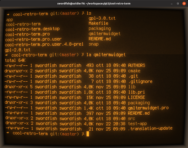
A terminal emulator which mimics the look and feel of the old cathode tube screens. It has been designed to be eye-candy, customizable, and reasonably lightweight.
This terminal emulator works under Linux and macOS and requires Qt5. It’s suggested that you stick to the latest LTS version. It uses the QML port of qtermwidget (Konsole)https://github.com/
“I’ve been meaning to write some kind of Important Thinkpiece™ on the glory days of the early internet, but every time I sit down to do it, I find another, better piece that someone else has already written. So for…
The Logo Smith worked with a past Client, Excedr, to design a Logo & Brand Identity for SuperblyCo : food & beverage equipment leasing company, along with a One Page Brand Logo Guidelines Template.
SuperblyCo provides: flexible equipment leases, comprehensive repair/maintenance coverage, and exceptional concierge-level customer service/support/responsiveness to food & beverage production companies.
SuperblyCo Logo Guidelines Template
The following images shows how I designed a number of primary and alternate logo design lock-up’s that will allow for greater flexibility when it comes to marketing, advertising and other brand identity uses and applications.
The primary logo is the Stamp (below, top line), which includes: Brand Name, Tag-Line and the ‘S’ Monogram all within a circular container.
The inner container (below, bottom line) containing the cSo is also a standalone logo, which is used for the front of the business cards, and envelope flap, for example.
To finish up, a set of Positive and Negative One Page Brand Logo Guidelines Template were created (which you can download the template for to base your own Logo Guidelines off from), and these are toward the end of this post.
Primary Logo Lock-up’s
Complete Range of Logo Lock-up’s
SuperblyCo Poster – One Page Brand Logo Guidelines Template
Logo redesign and rebrand for SifterApp, including: letterpress business cards, logo design and web application icons for Apple iPhone.
I recently completed the Sifterapp logo design, and was truly excited, and chuffed, to see how the letterpress printed business cards ended up.
Sifter LetterPress Business Cards printed on 220lb Crane Lettra by Evan Calkins (@EvanCalkins), Hoban Press (@HobanPress).
I really am quite proud of how the Sifter logo turned out, but more pleased that Garret’s vision for the card design came to fruition.
Garret was super intent on going as minimal as possible with the card design, and I really think it turned out brilliantly. The mono version of the Sifter logo looks particularly striking with the letterpress adding the finishing touch.
Garret has written up a neat little post, on the background of these cards, over on the Sifter blog: Practicing Craft via Cards.
This NASA Apollo 13 poster, designed by Justin Van Genderen, is absolutely gorgeous. Justin designed this Apollo poster as part of his: Location, Location, Location series, which you can view on Behance.
You can but limited edition prints via Print Shop, at a cost of $35. You’ll get an Edition #2, 16″ x 24″ screen print, with a 2-3 week delivery window.
I initially found this on Reddit, and it’s really become a very popular post.
Other Reddit users have been posting various other versions of this poster, even links to more historically useful bits of information relating to Apollo 13. Also see bottom of this post for a nice little animated version.
Go Reddit…
A reddit user: Plastuer, even created an animated version of it, such is this posters overall popularity:
And here’s an iPhone background version, by another Reddit user, ELFuhler.
Wikipedia: Apollo 13 was the seventh crewed mission in the Apollo space program and the third intended to land on the Moon. The craft was launched from Kennedy Space Center(KSC) on April 11, 1970, but the lunar landing was aborted after an oxygen tank in the service module (SM) failed two days into the mission. The crew instead looped around the Moon, and returned safely to Earth on April 17, 1970. The mission was commanded by Jim Lovell with Jack Swigert as command module pilot (CMP) and Fred Haise as lunar module pilot (LMP). Swigert was a late replacement for the original CMP Ken Mattingly, who was grounded after exposure to rubella.
The oxygen tank failure was caused by accidental ignition of damaged wire insulation inside it during a routine tank stirring operation. The SM soon lost all its oxygen, needed for breathing and for generating electrical power. Command module (CM) power had to be shut down to conserve its remaining resources for reentry, forcing the crew to transfer to the lunar module (LM) as a lifeboat. With the lunar landing cancelled, mission controllers worked feverishly to bring the crew home alive.

 Stumbled across this utterly fabulous Apple Website, via a
  Read More:
  Via:
Via: 


 Source: