Gorgeous math book covers from Dover Publications @doverpubs on X.
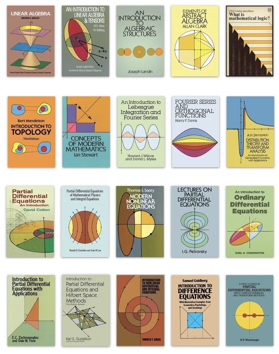
Gorgeous math book covers from Dover Publications @doverpubs on X.

Stellar Web Discoveries: Link_Log Digest #2 — 6th July, 2025
🚀 Visit: Stlrwb.link/Digest2
This is 2nd of my semi-regular Stellar Web Link Log Digest, with the most recent Links & Bookmarks that I’ve saved over on: stellarweb.space/links
SearchMySite.net ↗ — Search the Indieweb, Small web Digital Gardens"; Personal & Non-commercial Sites.
“Search real content by real people from the indieweb / the small web / digital gardens. Fully open source.” **SearchMySite.net**↗
🚀 Via: stellarweb.space

The notorious steps in Friston Forest; part of the South Downs Way route, which lead onto the Cuckmere Valley.
♥️ Free to Download & Remix in Adobe Lightroom: lightroom.app.link/1nCBQN6ZIUb
📷 Photo by: Smitho.graphics
🙏 Licence: CC BY-NC-SA

Photo of our local town church, St Leonard’s which was taken late afternoon; with some Lightroom editing to turn it into a sort of nighttime shot.
plus a few other random shots


Selection of photographs of Miss Poppy::


Miss Poppy doing her, “dare you to try and get the ball” posture…
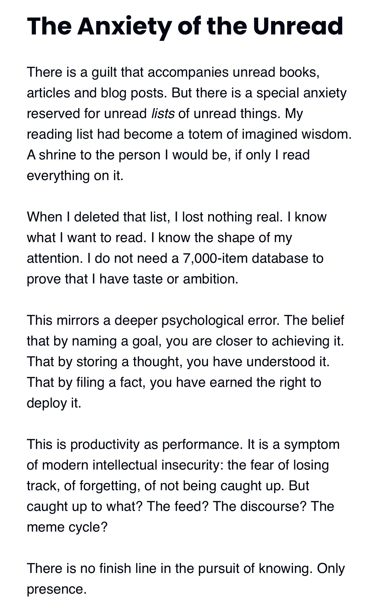
The Anxiety of the Unread “There is a guilt that accompanies unread books, articles and blog posts. But there is a special anxiety reserved for unread lists of unread things.”
Quote from: “I deleted my 2nd brain” ➔ https://www.joanwestenberg.com/p/i-deleted-my-second-brain
Stellar Web Discoveries: Link_Log Digest #1
Blog Post listing a handful of the most recent Links & Bookmarks that I’ve saved over on stellarweb.space:
🚀 Visit: Stlrwb.link/Digest1
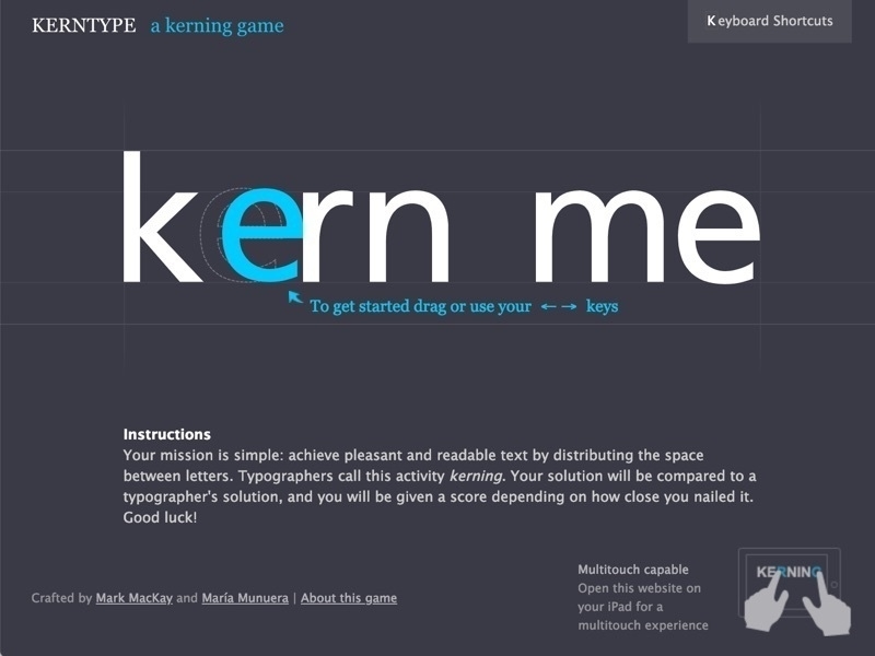
KernType — Practice Letter Spacing By @methodofaction
➔ Play: https://type.method.ac
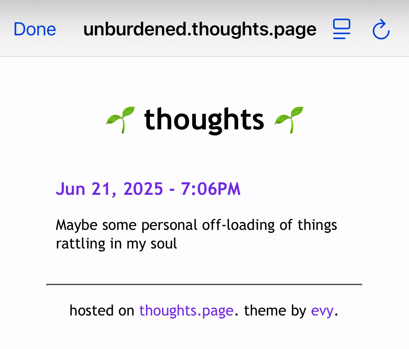
thoughts.page | hosting a small webpage for your thoughts
A platform for hosting a small webpage for your thoughts. It’s basically like twitter, but nobody can @ you.
It’s at a quieter, slower, more personal internet. a little space on the web, just for you.
↗ Source: https://thoughts.page
Indieweb & Personal Website Directories
“A growing collection of various Indieweb, Small Web & Personal Website Directories, that I’m steadily adding to on Stellar Web on a daily basis; open to any suggestions.
↗ Source: https://stellarweb.space/2025/06/17/website-directories-list/

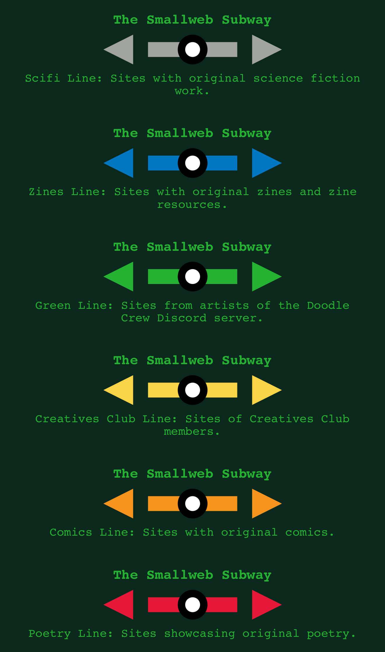
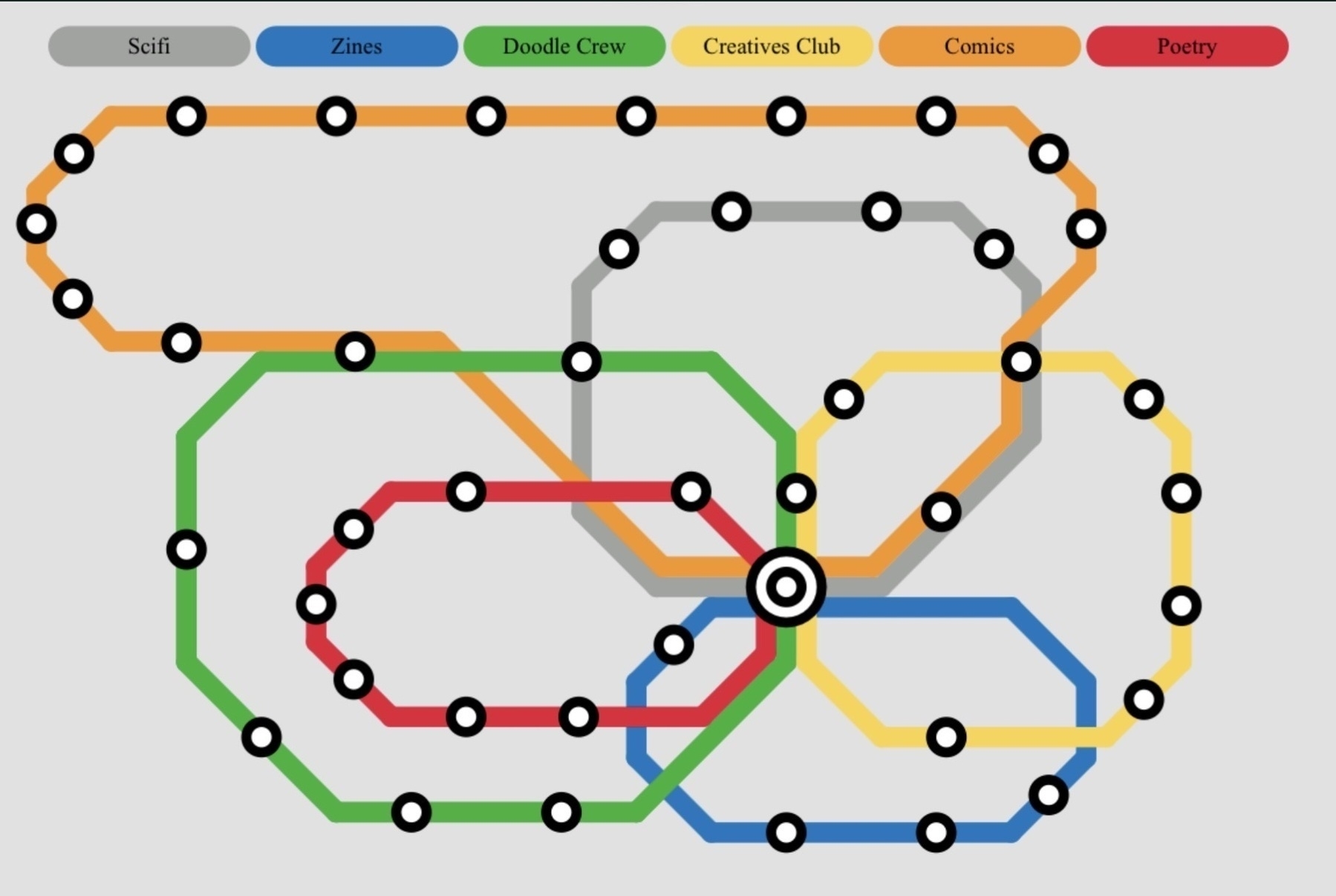
The Smallweb Subway — Subway Style Network of Webrings
An experimental project to connect communities using indieweb webrings. Maps representing a themed webring each stations a webpage in that theme.
↗ Visit Website: https://smallweb-subway/
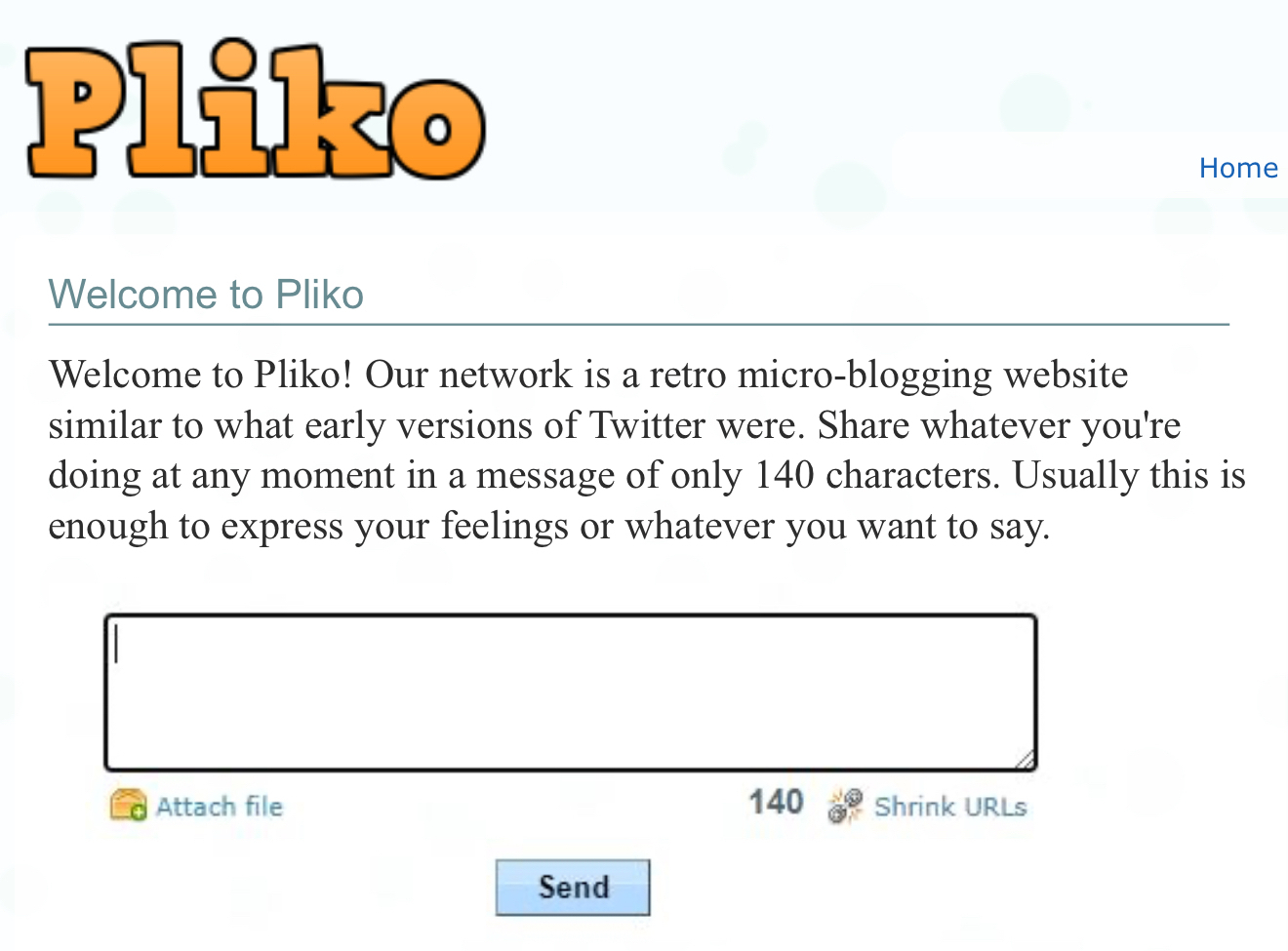
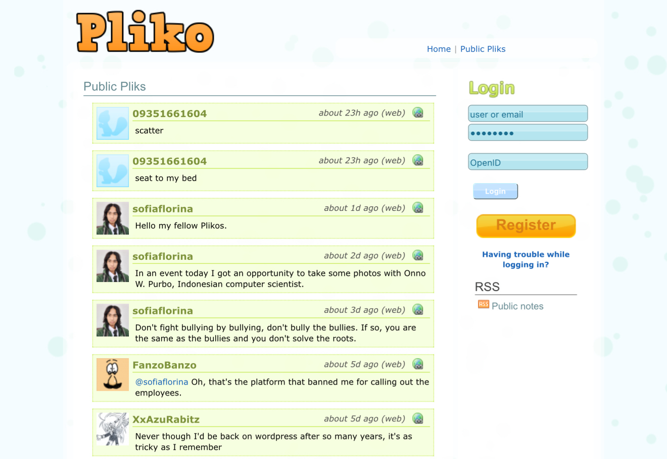
Welcome to Pliko!
“Our network is a retro micro-blogging website similar to what early versions of Twitter were. Share whatever you’re doing at any moment in a message of only 140 characters”
Sign-up: https://pliko.net
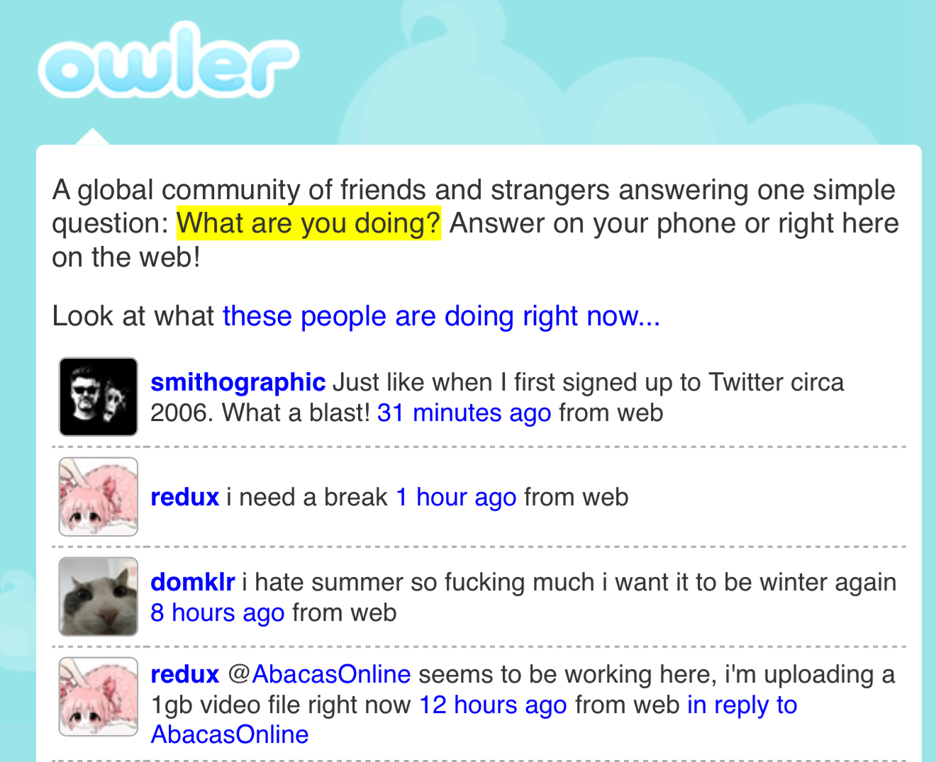
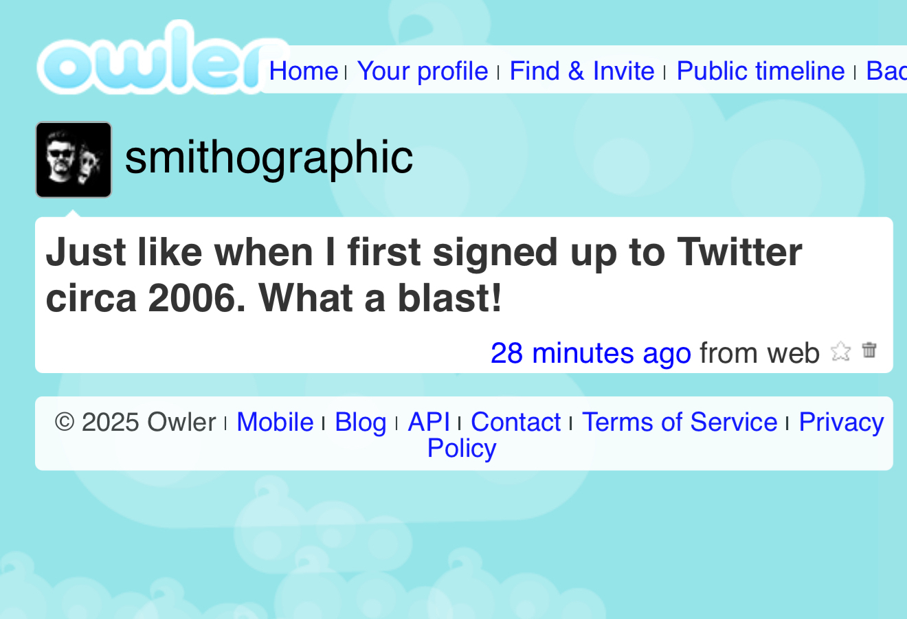
Owler - A Vintage Twitter ‘Replica’
“A global community of friends and strangers answering one simple question: What are you doing? Answer on your phone or right here on the web!”
Owler Sign-up: https://owler.cloud/signup
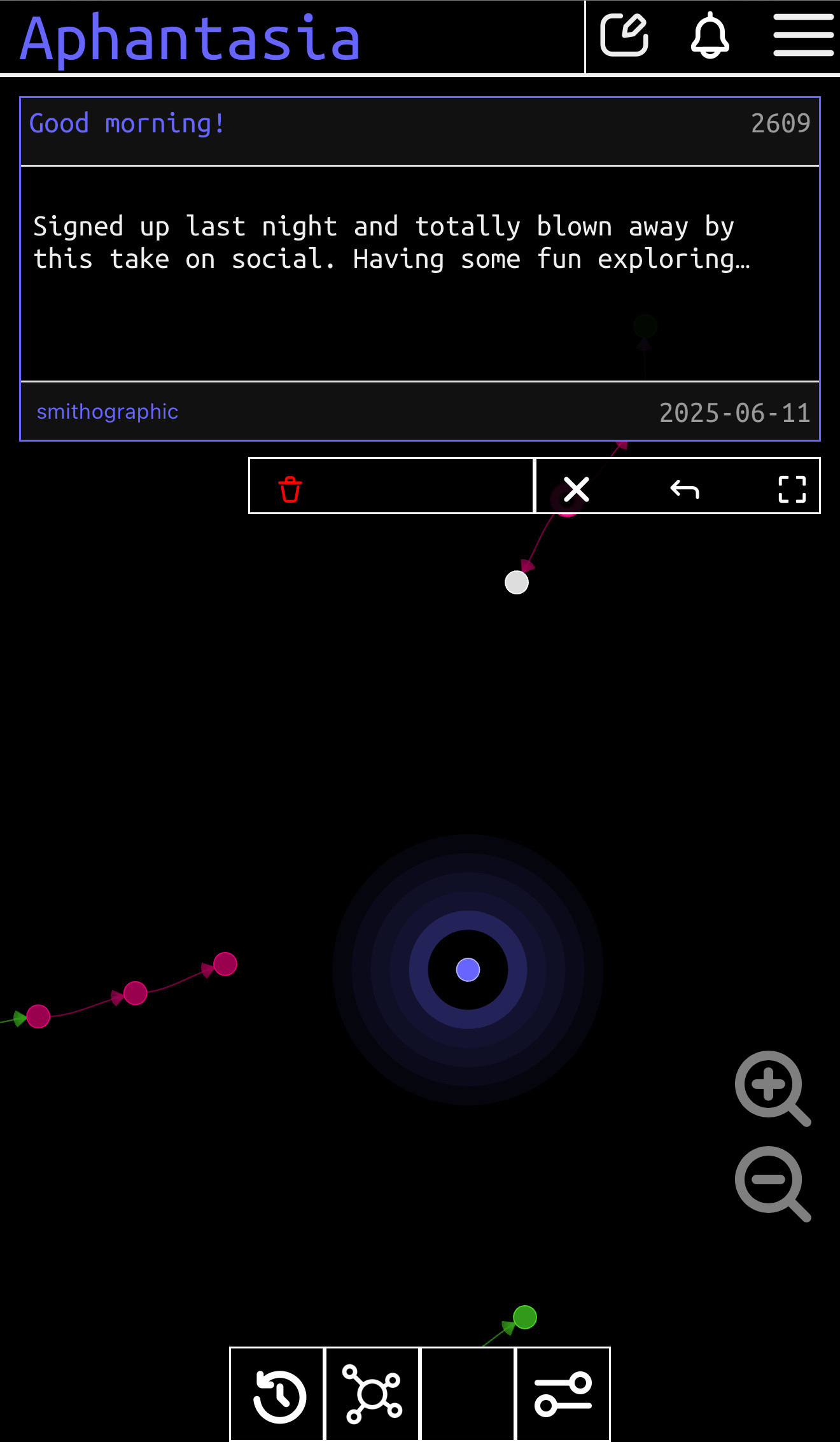
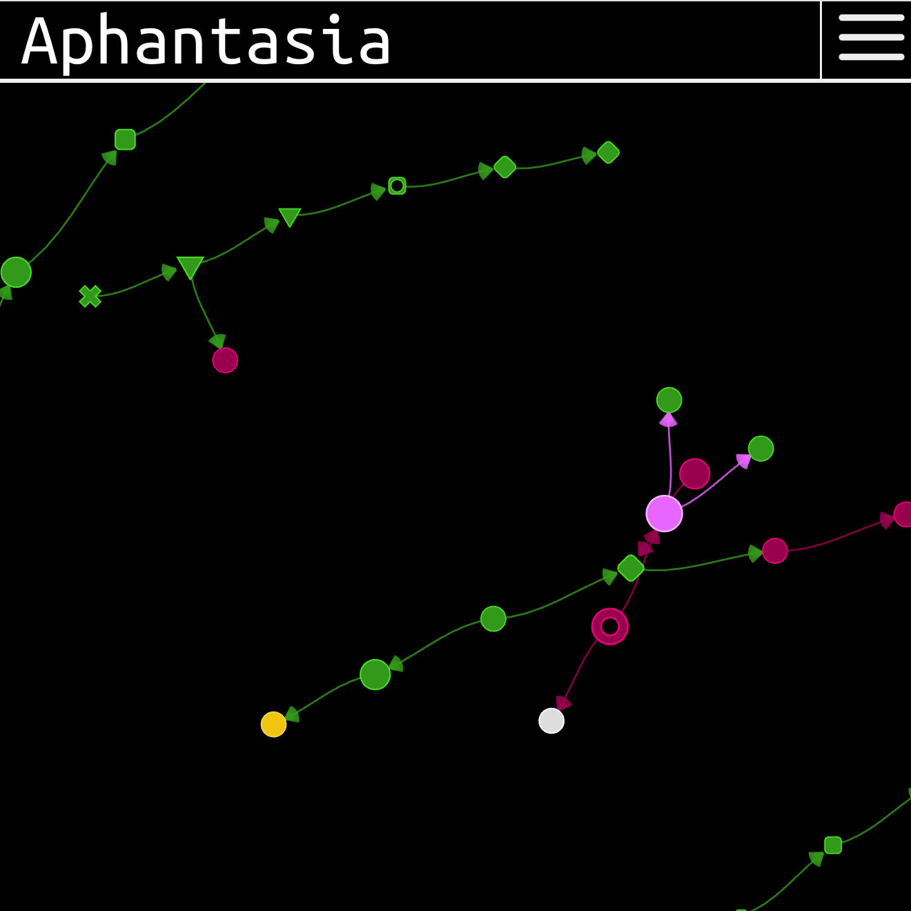
Aphantasia.io — Social Graph in Time & Space
“I like to call it a social network for graph enthusiasts. It’s a place where your thoughts live in time and space, interconnected with others and explorable in a graph view.”
➔ Source: Aphantasia.io
➔ Via: http://stellarweb.space/
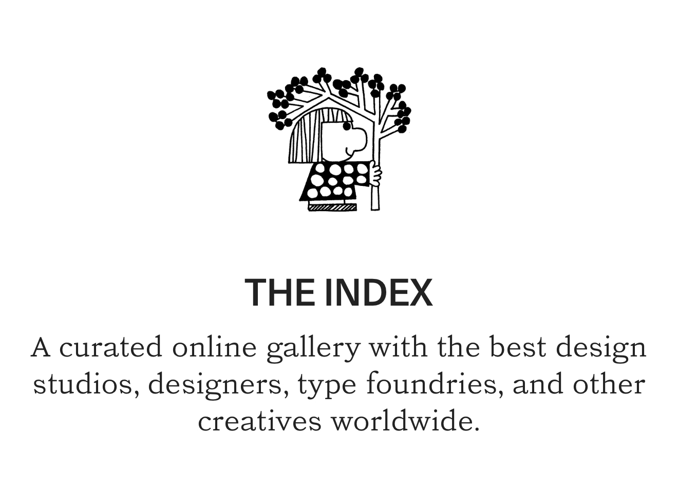
“A curated online gallery with the best design studios, designers, type foundries, and other creatives worldwide.”
❤️ Source: https://theindex.website/
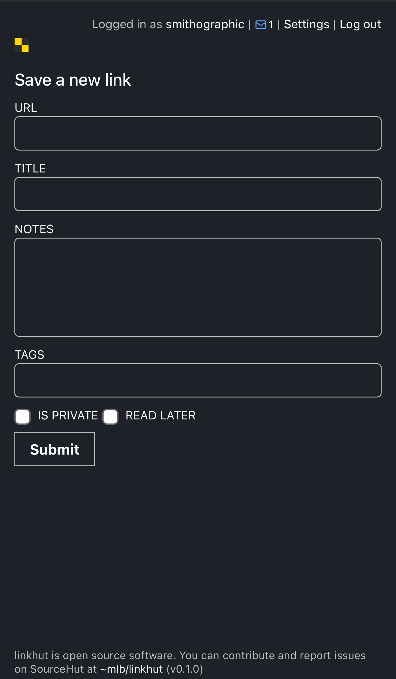
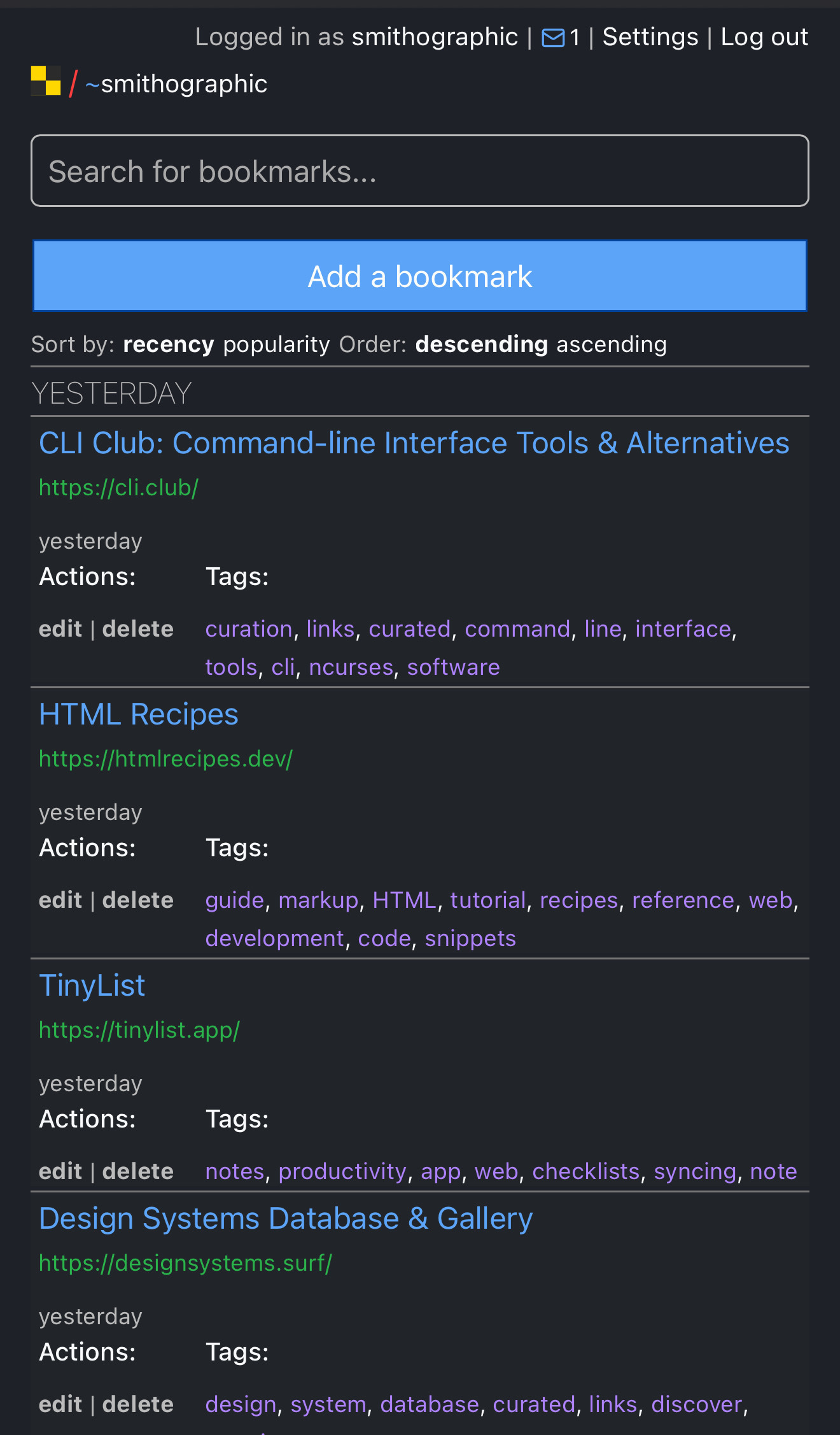
➔ Source: https://linkhut.org
“Linkhut is an Open-source social bookmarking service that allows you to tag, save, manage and share Web pages all in one place. With emphasis on the power of the community, linkhut greatly improves how people discover, remember and share on the Internet.”
✏️ I’ve been using Raindrop.io for a while, and had always been tempted to sign up to Pinboard, but finding Linkhut last night, I’m now fully onboard.
Has Delicious vibes; which is super cool as I really miss Delicious.
Also has IFTTT compatibly, so that’s really useful for me. Been able to easily import all my Raindrop bookmarks, and now any new Raindrop link is saved to Linkhut via IFTTT.
You can find me on Linkhut here: https://ln.ht/~smithographic

 The Stendig Calender was first designed in 1966 by Massimo Vignelli and taken that year to the Design Collection of the Museum of Modern Art.
Stendig Calendar — Designed by Massimo Vignelli first published on Smithographics - Logo Designer | Copyright Smithographics Logo Designer © 2025
Design Everywhere Design Everywhere is a digital platform showcasing real-life creative works of designers, both up-and-coming and established, from all around the world. @dsgnevrywhr ❤️ Source: designeverywhere.co
Design Everywhere Design Everywhere is a digital platform … first published on Smithographics - Logo Designer | Copyright Smithographics Logo Designer © 2025